

3·
3 months agoIt counts if you use it to visit a website participating in stats collection. Maybe excluded if the device has a touchscreen and requests the mobile site (I haven’t used a Steam Deck and don’t know its default browser’s config)
It counts if you use it to visit a website participating in stats collection. Maybe excluded if the device has a touchscreen and requests the mobile site (I haven’t used a Steam Deck and don’t know its default browser’s config)
It’s a 2x2 grid of vertical 2-panel comics. Could be made clearer by dividing them with thicker lines.

Unfortunately, copyright is purposefully designed so that most works going into the public domain are irrelevant by then and nobody’s willing to convert them.

Not a genius. This thing is called a monogram, the most basic logo design. Used mostly by couples, law firms and couples’ law firms.
You’re right, at that size the AI is not very concerning either.
Do your and your partner’s names both start with L?
Thanks, those give me ideas for making more operator logos like these (No AI but mostly CC0 (public domain) because my creative input is questionable, some are just tracing of scaled-down images with a few touch-ups; I’m not too concerned about sharing non-FOSS trademarks under a permissive licence at such low res)
In that way, yes, but the logos that feature small text (Groovy, Lua) didn’t turn out well at all.
Here’s the list of logos row by row so you don’t have to awkwardly ask what they are
Steam (not FOSS)*
“LL” (likely OP’s own design, not a FOSS project)*
Zigbee
Obsidian (not FOSS)*
Brave
Protonpass
Tailscale*
Home Assistant
Raspberry Pi (not open HW)*
Ubiquiti (not open HW)*
Android (not really FOSS)*
Signal
DigitalOcean (service)*
Ubuntu
Linux
Claude (not FOSS)*
Proxmox
Nextcloud
Jellyfin (rotated)
Trilium
Nginx
Tabby
Bash
Debian (rotated)
Docker
NodeJS
Python
HomeBox
XPipe
PiHole
Prometheus
Grafana
* not in gallery of printable sticker images
What is the “LL” monogram in the second one? I crudely recreated it to reverse-image-search but got no results.

Did you look closely at Jellyfin? The things in the dark are OK, they add flavor, which was an artistic choice − the problem is unrealistic silhouettes of people & animals in one mosaic piece. Also, it’s rotated on the laptop, and so is Debian.
The hand and face (bottom right) on Gimp is way more awful.
Looking closely at Perl, it seems there are photorealistic (hard to tell if AI) photos toned blue, abstract shapes that might be edited/vectorized photos, and in the bottom right there’s a bead necklace that’s so unshapely it’s an AI giveaway. Well spotted, it was indeed made using AI-generated images!
FOSS source is here.
The second “S” in “FOSS” is “software”. You did not publish software, just its output: bitmap assets needed to print the stickers. Thanks for CC-licensing your creative work but source would mean showing what’s under the hood. We don’t know how you sourced the images used in each triangular tile: generated to best correspond with AI? Matching pieces from Wikimedia Commons photos?
Edit: Look closely at Arch for example. It’s clearly just the logo placed in a hexagon, approximated by a mosaic of 24 triangles with AI images of differing quality. Is that snow or whipped cream? How can PCB traces be as blurry as watercolor and go nowhere? At least they’re topical: for Arch the prompt was probably “mountain OR architecture OR arch OR technology”.
Presumably, the process for each tile is this:
To consider this open source, I’d expect you to at least post the scripts you used in steps 3 and 5. To consider this good open source, it should contain a guide detailing this process, best with examples. I’d expect the AI part will be “bring your own model” but you could tell which one you used and its settings.
The idea is creative and “human” enough for me not to condemn it. “FOSS” or not though, you should disclose use of AI, especially since you’re selling the printed stickers.
Edit: yup, it’s made of AI images
This is not an AI-generated pic, it’s a photo taken with a real camera. The logos, however, are hexagons divided into 24 triangles each, and these triangles contain often thematically related (e. g. lions for Brave) photos or photorealistic AI images (the info I found online does not state either way) cropped to best correspond to what the triangle would contain if it just had the original logo. Basically, that corner of the whale surrounded by white was taken from a face photo (or AI pic).
I would get headaches from watching PAL (50Hz) CRT TVs for a long time. 60Hz monitors were noticeably better, and 75 or more was good to endure all day. Modern screens don’t go blank between refreshes (except PWM-based AMOLED) so the refresh rate is mostly irrelevant unless you want to shave off a few milliseconds of latency for serious gaming (then it’s best to match the refresh, render FPS and video signal).
But as I’m walking down the street and move my eyes, I notice cheap lighting whose drivers don’t smooth the 100Hz ripple of rectified AC. Especially if they reach 0% brightness during the ripple. This applies to:
So yeah, it’s not unhealthy, especially above 60 Hz. But it’s annoying for me to look around badly smoothed Christmas lights. And if they are of different phases (this is uncommon for Christmas lights (and even impossible in most American homes because they have 180° aka split-phase 240 V, not 120° 400 V) but always the case with multiplexed displays), I say a long rolling R to vibrate my face and see them wiggle.
A temperature knob could be added to control the pulse width. Get this shower to everyone who designed LED lighting with PWM frequency below 100 Hz.
This but with an acid and a base
I did’t know much about the German keyboard layout but I know the Czech one, which is derived from it (we both use QWERTZ) and was able to look up most of what I didn’t know.
So, the keyboard has 4 layers: default, Shift, AltGr, AltGr+Shift (the fourth one is not standard but is recognized by xkb; in Czech I use it for custom character mappings, in German it is standardized but Linux-only).
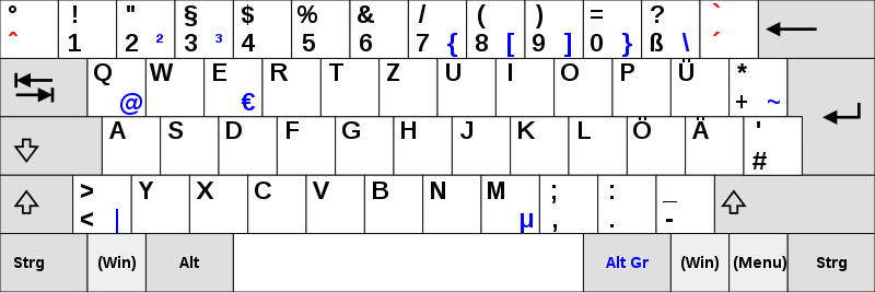
As you can see, AltGr+2 produces ², and AltGr+3 produces ³. I think the full-size “2” and “n” are misprints. My old Czech keyboard has some errors too. Edit: found out why there is “n” printed: the keyboard layout was designed for the OEM 850 code page that includes “ⁿ” but not “³”.
By the way, Czech is more chaotic:
´, ˇ, ˚, ¨) like on typewriters
˚ key twice prints the degree sign (°) twice (Windows) or once (Linux)§ key but we need to press AltGr+7 twice, then backspace (or Alt+96) for a grave (`), which is part of ASCII and used in Markdown€); it contains useful symbols ([]{}<>|\€$@#^&×÷`) as well as useless ones (Đđ – these are Slovene, why not the Slovak Ôô?), leading people to prefer Windows-only left-Alt+numpad codes (such as Alt+64 for @) that use the obsolete OEM-1252 codepage (the Unicode extension has to be enabled via registry and Alt+letters hex codes get passed to programs anyway, often defocusing the input element). I only found a Slovak one on Wikimedia CommonsEdit: found out why there is “n” printed: the keyboard layout was designed for the OEM 850 code page that includes “ⁿ” but not “³”.
Do you know why the 3 key has an n? I have a hunch:

This is clearly a tactical keyboard for use in military, aviation or maritime navigation systems! /s


Here’s an awesome audio version
https://www.youtube.com/watch?v=bEjZxh_rYXk